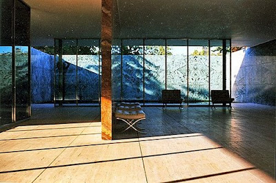
 I took these images of Mies van der Rohe's Barcelona Pavilion in the late 90s while visiting Barcelona for the first time. I came across them again recently and they reminded me of how impressive the space was. The pavilion had been one of the places I was really excited about seeing, as at the time I was a big Mies fan.
Although I now see how unsuited for functional living most of his buildings are, each time I visit one of them (I've planned visits to countries around his architecture!) I admire his single-minded obsession with aesthetics and organisation of space.
Mies used swathes of marble in the Barcelona Pavilion which contrasting with the glass walls, gives an understated and sophisticated feel. He also designed the classic Barcelona chair for the pavilion.
love these photos -- the faded film adds something, some softness to his work. and the light you've captured is just beautiful.
ReplyDeleteyou're right about van der rohe in terms of functionality. i've never seen anything of his in person, so you have to tell me: are the barcelona chairs as comfy as they are beautiful?
hi anna,
ReplyDeleteyes, they're pretty comfy - large and roomy.
they turn up everywhere when you start looking for them..
they're especially found in waiting rooms and if you're ever at the airport in barcelona they're there :)